
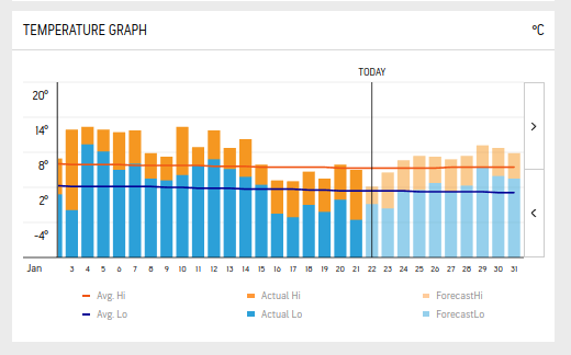
I reckon it would be easy to just overlay the predicted colour on the chart when an actual days min max has been recorded, such that the colour at top/bottom is which one was actually largest min or max, predicted or actual.
Could then see accuracy of the predictions…
But maybe that would be science they do not like, the science of studying the effectiveness of the scientists eh!